Workflow automation platform
UI Design | Visual Design | Branding | Illustrations

Project background
Qmiix is QNAP company's “integration platform as a service (iPaaS) solution” that automates self-defined workflows between multiple clouds, QNAP NAS, and other software, greatly assisting businesses in reducing the time, effort, and costs involved in digital workflows
Project scope and goals
- Design, development and support for the web, android and IoS platforms
- Delivering the experience via a familiar , understandable conversational flow.
Team
2 UX designers, 2 UI Designers,
1 Product Owner, 1 Scrum Master
And development team
Creating visual designs,
branding and illustrations.
Duration
November 2018 to April 2019
6+2 months
“I was UI(Visual) designer in this project and my responsibilities were to conduct brainstorming and ideation,
to set brand aesthetics and visual language for QMIIX product. Designing visuals for web, android and iOS screens by collaborating with client and development team for review and implementation of designs.”
Approach
PLANNING
Sprint and milestones planning based on number of wireframes for all three products web android and iPhone by collaborating with scrum master and dev team.
DISCOVERY
High collaboration with client, UX designers to know about users and dev team to know about constraints.
DESIGN
Designing based on knowledge gain in discovery phase and iterating based on client and co designer's feedback.
DELIVER
Constant and on time delivery to client for design review and to dev team for design implementation with necessary assets.
PLANNING

Front end developer
Back end developers
Scrum master
UX Designers
Visual designer(Me)
Development team has dedicated front end and backend developers for each product I.e web, android and iOS developer. But thorough planning was required for design team to plan well to execute the project in sync with development team and deliver the deliverables on time to client and dev team.
DISCOVERY
Understanding users was very important to set the visual aesthetics for the product. Also setting up good and efficient collaboration system between UI designers and developers.
Following were few questions shared with developers and client.
Questions to UX designer
- Who are the users of the product?
- High level understanding on user pain points and goals.
- When and why they will be using this product ?
- What will be the average usage time of the product?
- Surface level of understanding of context
- How target audience's typical day look like?

Questions to developers
- What are the front end back end programming languages will be used for this product?
- Any framework will be used for front end? For example Angular, Bootstrap.
- For icons and illustrations, is SVG file format will work for all three platforms?
- Compatibility check on fonts for web, android and iOS Platforms.
Design sample
DESIGN
Empathizing with user was the key to set visual aesthetics, look and feel for the product. Design inception worksheet was utilised to set the aesthetics.
Design option 1 - Calm & Settled
First design option have calm, secure, trustworthy mood and this is transmitted through cool colors, square shapes and open space.
It should create a feeling of comfort for the reader.


Design option 2 - Cheerful & curious
Second example has an happy, fresh, cheerful and creative mood transmitted through the gradient colors like vibrant shades of purple and pink.
This mood is created to reduce the stress and give a break from the busy schedule to the target audience.
Design inception worksheet

Check out how it helped me in "Branding"
Mood board

Design Option 2

Above two options were presented to the client for the review, after carefully considering both examples, client chose to go with the “Cheerful and Curious” design option 2 for this product.
Concept of "Humanizing the Product"
Going back to the "Discovery Phase", the target audience of this product has busy schedule everyday, uses many apps, sometimes frustrated and stressed with over loaded work. After studying personas, decided to introduce "Humanizing the products"
Following are the advantages how this design concept make products delightful
Kono Model
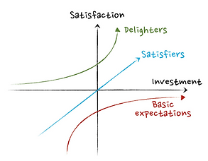
Source:
1. Illustrations can reduce user frustration by humanizing products
2. Illustrations can increase customer satisfaction
3. Illustrations can help in retain users by Improving onboarding
4. Illustrations could give a free PR and marketing boost
5. Illustrations can build strong brand recognition – fast
Final illustrations

Mood board
Design inception worksheet
Design Option 1
DELIVER
Within 6 to 8 months delivered visual designs for 4 products as follows.
- Qmiix end user website
- Qmiix android app
- Qmiix iOS app
- Qmiix admin portal
B2C Products
B2B Products
Design deliverables to all stakeholders
End user web portal

Responsive Design

End user mobile app

Admin portal

Deliverables to development team
Specifications and Assets
Specification link shared for all three platforms
Web, android and iOs.
Specification link contains following to help development team for easy and systematic design development.
- CSS Properties of UI component.
- Icons, Illustrations and images
- Text properties
- Measurements

Style Guide
The style guide been created and shared with client and development team to maintain consistent design throughout the cross platform.
Style guide included
- Color palette
- Typography
- UI elements like buttons and its state style
- Illustration style
- Logo usage

Learnings

1.Gained valuable experience in systematic and efficient project execution through agile project management.
2.Applied deep product knowledge to drive success, leveraging the concept of "Humanizing the Products" to enhance the functionality and user experience of the Qmiix product.
3.Collaborated closely with cross-functional development teams, gaining insights into app and website development. As a designer, I learned to prioritize responsive design and create assets tailored for Android apps, ensuring seamless integration across platforms
Qmiix (Qmiix is QNAP’s integration platform) product launched in the year 2019.
And now its
Available on
Website

Google Play
App Store


Qmiix Branding
Sample sketches from branding brainstorming sessions
Naming the product
Tried combination of multiple words related to client's company name, purpose of the product, elements of the product to come with unique name.
Product name - Qmiix
Choosing logo type
Explored different types of logos and when they used.
To create strong brand recognition and to make product name catchy and memorable wordmark logo type is finalized.
Logo type - Wordmark
Logo design
Logo is designed with "Golden Ration", where all circles are golden rings in logo construction.Aesthetics are set based on
"Design inception worksheet" .
Few key attributes are
- Playful
- Friendly

Final Logo
Logo Testing
1.BALANCE - Visual balanced
2.BACKGROUND - Works on different backgrounds


3.ACCESSIBLE (Color Blind)

4.SCALABILITY - Works on different sizes

5.FLIP - Can be read even IF its flipped

6.CONTAINERS - Fits into a few common shapes.

7.PIXELATION - Retains most of its form at low resolutions.
8.BLUR - Stands out to someone on a first glance.

Color Palette

